Learning how to letter a comic means working out the reading order, choosing a clear comic font, placing balloons and captions in that order, and checking type size against the printer’s specifications. Hand and digital methods both work.
Lettering is one stage in a longer production line. For where it sits among the other jobs, read how does a comic book studio work.
What you need before you start
Lettering goes over finished or near-finished artwork, so the page layout must be settled before any balloon is drawn. These starting conditions save the most rework.
- A final script. Dialogue, captions and sound effects should be locked, because rewriting a line after balloons are placed means redrawing the balloon around it.
- Clean page art with breathing room. Artwork with empty areas near the top of each panel is far easier to letter than art where every corner holds detail.
- A chosen method. Hand lettering needs a pen, a ruler and pencil guidelines. Digital lettering needs software that supports text, vector shapes and separate layers. The comparison further down helps you pick, and best software for making comics covers the tools.
- Your printer’s file specification. Page size, bleed and minimum type size vary by printer, so ask for the specification before you set any type.
Lettering a comic page, step by step
Step 1: Map the reading order
Read each page as a stranger would and number the lines of dialogue in the order they should be read. Balloons are read in the order they sit on the page, so the earliest speaker belongs highest and furthest toward the start of the reading direction. If two characters speak in one panel, the balloon you want read first goes above or ahead of the other.
Fix collisions on paper before touching the art. When a panel holds more dialogue than the empty space allows, trim words with the writer instead of shrinking the type, because small text is the most common reason lettering becomes hard to read.
Step 2: Choose a comic font or lettering style
A comic font is a typeface built for lettering dialogue, with even stroke weight and letterforms that stay readable in small blocks of capitals. The aim is a style you can keep consistent across the whole book. Pick one face for dialogue and keep any variants, such as bold for emphasis, within the same family.
A print vendor’s guidance on font size and legibility for printed signage says non-serif fonts tend to be easier to read from a distance than serif fonts. It also warns that thin letter styles can be harder to read and that letters that are too thick are hard to read as well. That guidance concerns display reading, so treat it as a tiebreaker. When choosing between faces, favour the one with a plain, medium-weight stroke.
Step 3: Set the text size for print
Size is measured in points, and the same vendor guidance gives a reading-distance rule for printed material held at book or magazine distance. Its figures are a practical starting range rather than a comic-specific standard, so confirm the final size with your printer.
Set the size once, then letter the whole book at that size. Change it only for deliberate effects such as shouting or whispering. Set text at the size it will print. The vendor warns that enlarging small letters can cause unsightly pixelation, which matters most when lettering is made as raster artwork.
Step 4: Rule guidelines or set up the lettering layer
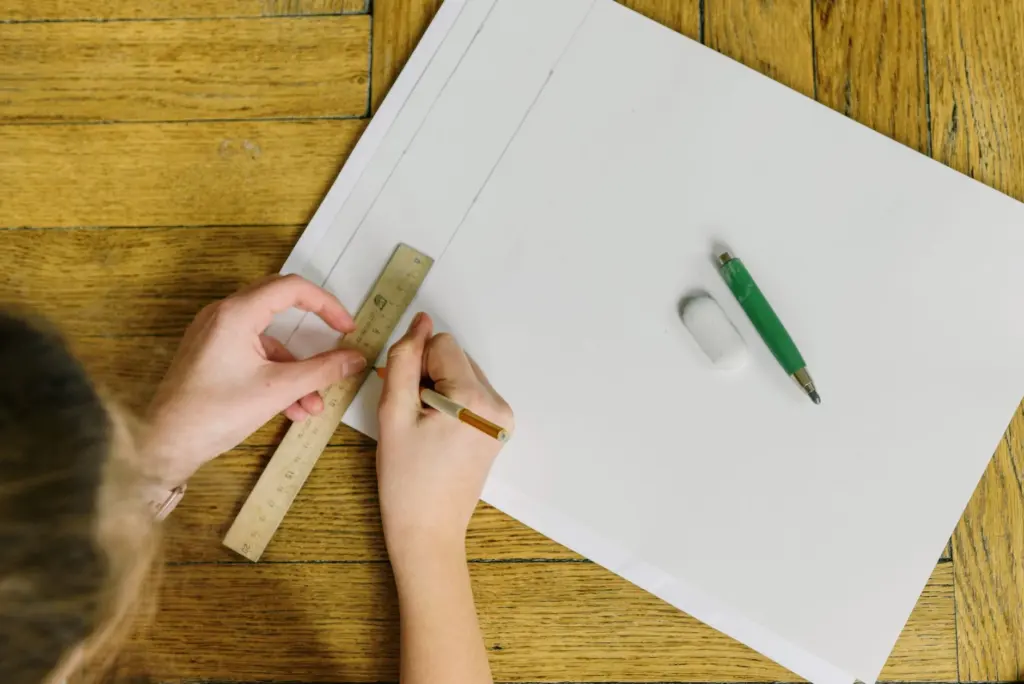
For hand lettering, draw light pencil guidelines for every line of text before inking. Rule them on the art board with a ruler so lines stay level and the letter height stays steady. Keep the guidelines faint enough to erase cleanly after the ink dries.
For digital lettering, create separate layers for balloons, text and captions above the artwork. Keeping text on its own layer lets you edit a line later without disturbing the shapes beneath it. Name the layers so a colleague opening the file can find them.
Step 5: Place balloons and captions in reading order
Letter the text first, then draw the balloon around it. Placing text before shapes keeps balloons snug and prevents lines from being squeezed to fit a shape drawn too early. Position each balloon so it avoids faces, hands and any detail the reader needs to see.
Check speech balloon placement against the numbers from Step 1. A reader’s eye should move from balloon to balloon without doubling back. If a tail would have to cross another balloon to reach its speaker, move one of the balloons.
Step 6: Add tails, captions and sound effects
Point each tail toward the speaker’s mouth or head, and keep it short. Caption boxes, which carry narration rather than speech, sit in the corners of panels where they do not block the art. Sound effects are part of the art as much as the lettering, so give them a style distinct from dialogue and place them where they do not disturb the balloon order.

Step 7: Check the page and export
Read the finished page from start to finish, speaking each balloon aloud in order. Any line you stumble on is a placement or wording problem. Then compare your type size and file settings with the printer’s specification before exporting.
Lettering is a separate craft from coloring, which is covered in how to color comics digitally. Keep the lettering layers separate so either stage can be revised without redoing the other.
Hand lettering and digital lettering compared
Hand lettering gives each page a unique, organic look and needs no software, but a mistake means redrawing that area and consistency depends on the steadiness of your hand. Digital lettering lets you edit text, reuse balloon shapes and change sizes across the whole book, but it demands a consistent font choice and careful layer management.
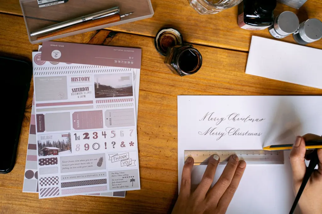
- Choose hand lettering if you want a personal style, work on a single short piece, or already own the pens and art board.
- Choose digital lettering if the text may change, the book has many pages, or the script is still moving. Edits cost far less time than redrawing.
- Mix both when a hand-drawn sound effect sits over digitally set dialogue. Keep the two visually consistent so the page does not look patched together.
Checkpoints before you send files to print
Use this table as a last pass. The sizes come from print guidance for text read at book and display distances.
| Checkpoint | Reference value | Planning use |
|---|---|---|
| Text at book or magazine reading distance, about 1.2 feet | 8 pt minimum; 10, 11 or 12 pt most popular | Treat 8 pt as the floor and aim for the popular range for dialogue. |
| Text read at arm’s length, about 1 foot | 10 pt or 12 pt | A useful target for main body text, comparable to magazine text. |
| Enlarged small lettering | May cause pixelation | Set text at its final size instead of scaling it up afterwards. |
| Stroke weight | Very thin or very thick strokes reduce legibility | Choose a medium-weight face for dialogue. |
These figures come from a print vendor’s font size guide; they are general print guidance, so your comic printer’s specification takes precedence.
Frequently asked questions
What is a point in lettering sizes?
A point is roughly 1/72 of an inch. The same vendor guide says a font size of 144 pt prints a letter about 2 inches tall, and 360 pt prints one about 5 inches tall.
Does the banner sizing rule apply to comic pages?
No. The banner rule of 72 pt of letter height for every 10 feet of viewing distance is meant for signs read from far away. A comic is read at hand distance, so use the reading-distance sizes in the checkpoint table.
Can any font be used in a printed comic?
Not automatically. A font’s licence decides whether it may be used in printed, commercial work, so read the foundry’s licensing page before you commit a whole book to it.