Quick answer: To learn how to color comics digitally, set up a clean line art layer, lay down flat colors, test a palette, then add shadows and highlights on separate layers. Check the printer’s file requirements before exporting.
Coloring is one stage in a larger production pipeline. For how it fits with the other roles, see how does a comic book studio work.
What you need before you start
The process works with a modest setup. The checklist below covers the pieces that matter most.
- Inked line art. A scan or digital file of the finished inks. The pages themselves usually begin as a script, and how to write a comic book script covers that earlier stage.
- A digital tablet. A digitizing tablet, also called a graphics tablet, lets you draw directly onto a digital surface and captures your strokes digitally, according to Clip Studio’s tips article. A mouse can fill flat areas, but a stylus suits shading and rendering far better.
- Painting software with layers. Any program that supports layers and blend modes will do. Software options are covered under Step 2 below.
- A rough idea of the scene’s mood. Know the time of day, the light source and the emotional tone before you choose colors.
The expected outcome is a layered, print-ready colored page. Every stage stays editable because base colors, shadows and highlights each live on their own layer.

The coloring workflow
Work in this order. Each step builds on the one before, so skipping ahead tends to mean redoing work.
Step 1: Prepare the line art
Import the scan or file onto its own layer. If the page is a scan with a gray or off-white background, extract the line art by setting the layer property’s expression color to monochrome. According to Clip Studio’s tutorial, the line art of the comic is then extracted.
The tutorial author then adjusted the color threshold to 130% and the alpha threshold to 246% to reduce noise. Those values were tuned to her own scan. Treat them as a starting reference and adjust until stray specks disappear without breaking thin lines.
Step 2: Set up layers for coloring line art
Layers let you add components to an image and work on them one at a time without permanently changing the original. That is the main reason to color in layers rather than on the line art itself.
A dependable stack, following Clip Studio’s coloring guide, runs from bottom to top:
- Neutral base. A white or neutral light gray layer under everything. It is the reference for all other colors in the artwork.
- Base colors. The flats, covered in the next step.
- Shadows. A new layer above the flats, kept separate from highlights.
- Highlights. Another separate layer for lit areas.
- Line art. Always on top, with the blending mode set to Multiply so the colors beneath stay visible.
Keeping shadows and highlights apart means a change to one never forces you to repaint the other.
On software: the guide demonstrates its techniques in Clip Studio Paint and states that everything it explains can be done with other software, including Photoshop. Choose by the features that matter for this workflow: layers, blend modes such as Multiply, and a way to shift all colors at once. Clip Studio Paint has a Tone/Saturation/Luminosity dialog for that last job, opened with Ctrl+U (Cmd+U on Mac) after merging layers.
Step 3: Flat the page
Flatting is the first coloring pass. It fills each area with a single color that has no shadows and no highlights, as Clip Studio’s guide defines flat colors.
Colorists flat first because every later layer depends on it. Shadows and highlights sit above the base colors, so the shapes and the local color of each object, such as skin, clothing and background, need to be settled before shading starts. Fix a wrong hue at this stage and only one layer changes. Fix it after rendering and several layers need repainting.
Work on the base color layer, below the line art. Fill every region completely, including areas that touch the line art edges, so no gaps show when the line layer is hidden or adjusted. Use distinct, even bright colors if you plan to select regions later, then refine them in the palette step.

Step 4: Choose a color palette for the scene
Pick the palette from the scene’s mood, then test it on the flats. Clip Studio’s guide describes four classic schemes you can match to a scene:
- Monochromatic. One base hue and all its variations, which suits a unified, quiet scene.
- Analogous. A color plus its neighbors on the color wheel, giving subtler tone variation for calm or cohesive moments.
- Complementary. Two colors on opposite sides of the color wheel, which gives greater contrast and fits tense or dramatic beats.
- Triadic. Three colors equally spaced around the color wheel, which allows variety while staying organized.
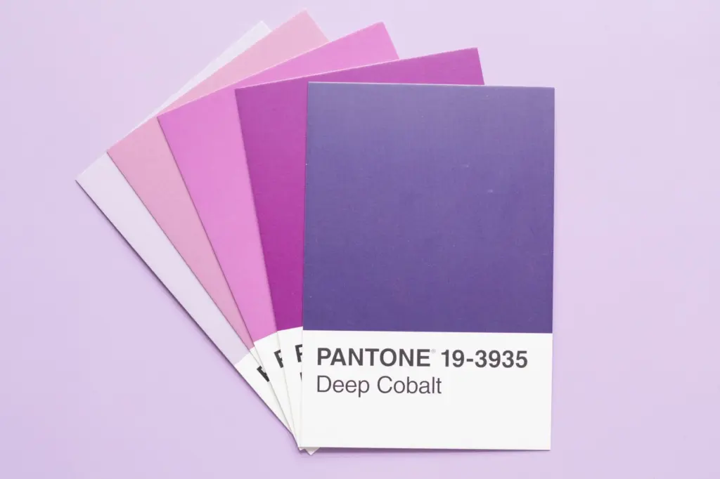
Test colors against their surroundings. Depending on the background, the same color can appear very different, so judge a swatch in place on the page rather than in isolation. To compare whole-page options quickly, merge a copy of the layers and shift all colors at once with the Tone/Saturation/Luminosity dialog.
Step 5: Add shadows
Choose the light source first, then add shades on the opposite side. Deciding it up front keeps every figure and object on the page lit consistently.
Paint shadows on their own layer above the flats. Clip Studio’s guide sets the shadow layer to Multiply and lowers the opacity if the result is too dark. Choose the rendering style to suit the book:
- Cel shading. Applies flat shades, giving a cartoon look and creating depth with hard-edged shapes.
- Soft shading. Uses gradual shading for a smoother, more painterly finish.
Pick one approach per project. Mixing hard and soft shading on the same page without a reason can make the artwork look inconsistent.
Step 6: Add highlights and render
Put highlights on the separate highlight layer, on the side facing the chosen light. Build up in small passes. Hide the line art now and then to check that the colors read well alone, and return to the flats if a hue fights the palette.
Stop rendering when the page reads clearly at a glance. Extra detail that the lettering will cover, or that the printed page cannot show, adds time without improving the result. Lettering is its own task, covered in how to letter a comic, so leave room on the page for it.
Step 7: Prepare the files for print
Colors on a monitor do not always match colors on paper, so the final step is to match the output to the printer’s needs. Request the print vendor’s file preparation guide before you export and follow its settings for color mode, resolution and page size.
Keep the full layered file as your master. Because layers leave the original image unchanged while components are edited separately, you can return to the shadows or palette later and re-export if the printer asks for a correction.
Checkpoint table
Use this table to confirm each stage before moving on.
| Stage | What to check | Planning use |
|---|---|---|
| Line art | Layer on top, set to Multiply, with noise removed | Fix specks now so they do not show through later colors |
| Flats | Single fills with no shadows or highlights, sitting above a neutral base | Settle local colors before any shading begins |
| Palette | Scheme tested against its surrounding background | Adjust hue, saturation or luminosity across the page before rendering |
| Shadows | Separate Multiply layer, opacity lowered if too dark | Keep light direction consistent from panel to panel |
| Highlights | Separate layer matching the chosen light source | Stop when the page reads clearly at a glance |
The stages and settings in the table follow Clip Studio’s coloring guide and its line art tips article.
Frequently asked questions
What is flatting and why do colorists do it first?
Flatting fills each area with a single color that has no shadows or highlights. Colorists do it first because shading layers sit on top of those base colors, so settling the base keeps later corrections small.
What software do colorists use for comics?
Clip Studio Paint and Photoshop are both named in the guides used here. Clip Studio’s guide says its coloring techniques can be done in other software, including Photoshop, as long as the program offers layers and blend modes.
How do you choose a color palette for a scene?
Match a scheme to the mood: monochromatic for unity, analogous for subtle variation, complementary for contrast, triadic for variety. Then test the colors in place, since the surrounding background changes how a color looks.
How do you set up layers for coloring line art?
Put a neutral base at the bottom, base colors above it, then separate shadow and highlight layers. Keep the line art on top with Multiply blending so the colors below stay visible.